General Assembly CLIENT: code for Australia
Improving conversion rates for Code for Australia

Background
Code for Australia’s mission is to drive digital transformation into the Australian government to create a positive impact on society by connecting government innovators, corporate leaders, and creative technologists through their 3 programs: Fellowship, Academy and Civic Lab. The Code for Australia website is a single portal which serves a wide range of stakeholders including developers and designers, government, corporates and citizens.
.
overview
The team at Code for Australia sought to improve the clarity of communications and better drive conversion behaviour on their homepage.
First step was an initial business analysis to better understand their unique business model. This was followed by an heuristic analysis which was conducted to discover any usability issues and form a hypothesis around why users were not signing up.
User interviews by phone or in person contributed to research around personas and user journeys. Ultimately problem statements for each user type revealed some core issues with the site.
.
.
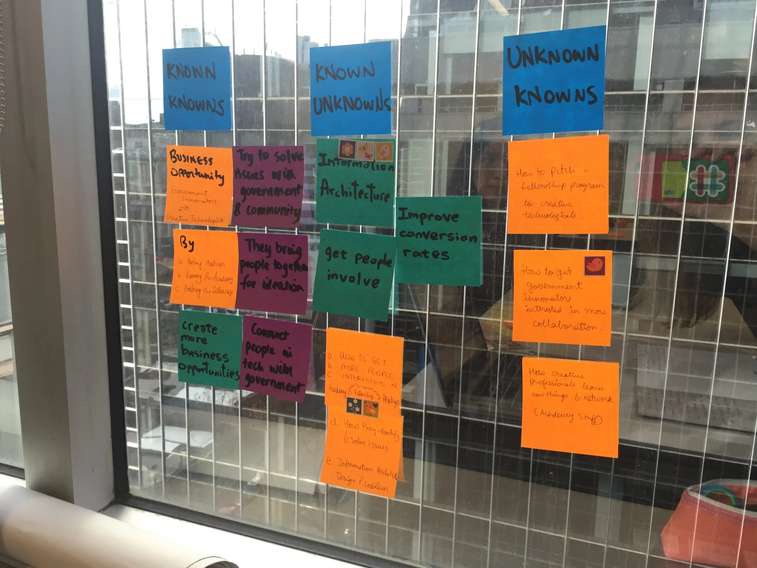
The knowns and unknowns of the brief.
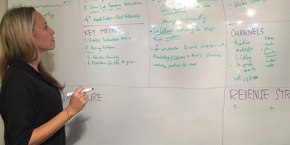
Conducting a lean canvas as part of research into the business.
Understanding how Code for Australia works
It was a standout clue that further analysis of the business needed to be done after scrutinising the website from top to bottom. A lean canvas as well as a decision matrix was done collaboratively with the client. This lead to the hypothesis that calls to action were unclear and the pathway to proceed had been muddled by information on the different programs sounding similar and being poorly communicated.
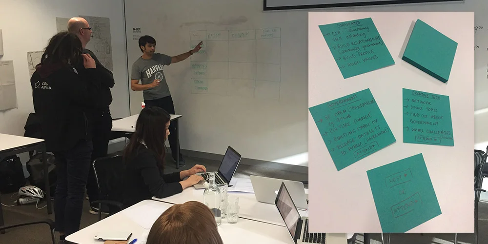
Collaborating on a decision matrix with the client and ensuring the calls-to-action are accurate.

Phone interviews such as this one were invaluable for persona research.
Rewarding user interviews
Many in-depth user interviews were conducted either in person, over the phone or via survey. These yielded rich results which were turned into key insights and opened up ideas for future opportunities too. For example some key insights included the fact that government decision makers do not use the site; that corporates have a specific list of details that they need to see on the site in order to follow through with a sign up; and that a timeline of the fellowship year’s activities would very much encourage creative technologists to become part of the program.
Off the back of these interviews, personas were developed to help create the problem statements that would form the backbone of the proposed solution.
Conducting usability testing with some of the interviewees helped consolidate some of the problems with the user journeys which informed some UI recommendations made to the client.

A site audit to reveal broken UI.

The user journeys were based on interviews and observing interviewees complete tasks on the site. They highlighted many issues with wayfinding.

Valuable key insights were distilled from interviews and a survey.
Ideation fun
The client delighted in collaborating where possible and very much enjoyed all ideation sessions. These were run as design studios to rapidly generate ideas, iterations and solutions to the problem statements we had developed. We did weekly standups with the client, along with some of the Fellows who were engaged in government programs at the time..

Ideation sessions opened up solutions such as a mini Q and A to help users find which Code for Australia program is right for them.
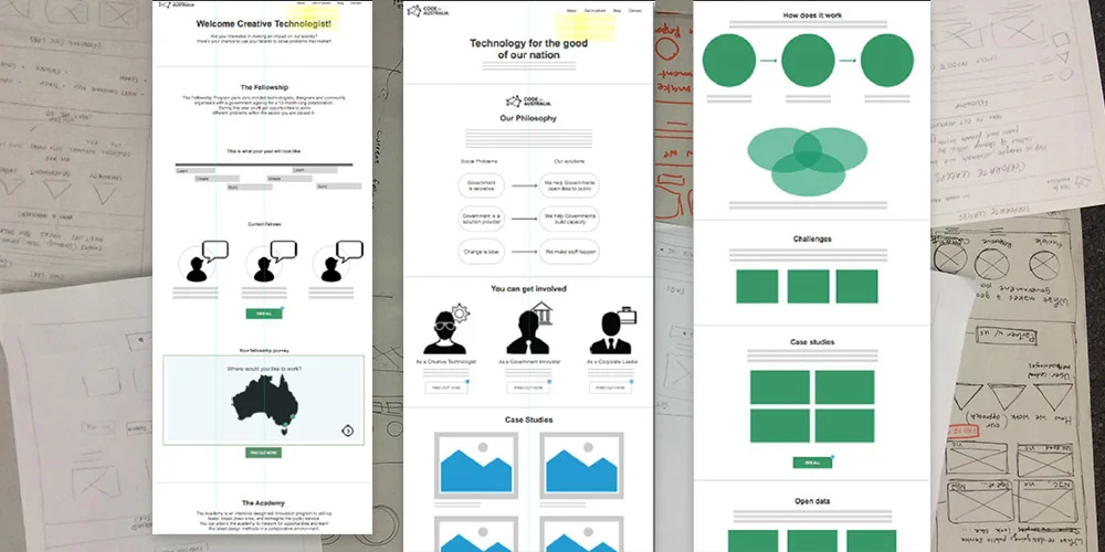
Wireframe sketches lead to some low-fi Axure prototypes which were a quick way to get some user test results in a very short turn around time.
Quick insights through low fidelity prototypes
Due to the quick turn around time for the project, some low-fi wireframes were created to get some instant user feedback on some of the solutions posited. Among some of the user feedback was the insight that the terms “Fellowship”, “Civic lab” and “Academy” were incomprehensible to users new to Code for Australia. This was solved by adding some simple copy to explain the programs in a few words where appropriate. Testing also revealed UI issues like the fact that users found the pages were too long to scroll through so a few other layout options like tabs were suggested and additional user testing will validate whether this was sufficient.

Weekly standups with the client and Code for Australia Fellows
Next steps
With the project length being short, there were limitations to the number of iterations of prototypes that could be tested. It was suggested that higher fidelity wireframes be developed and tested next. Due to the user feedback about scrolling and language issues, a copywriting style guide and content strategy should be planned too. A service design blueprint was highly recommended to better support and retain Fellows throughout their journey and beyond. This will likely also provide valuable insights into the Fellowship experience and how to leverage this information in order to retain Fellows and attract new ones.
Brilliant feedback
At the end of the project, there was some high praise from client about the insights presented and an offer for ongoing work in the future.