CLIENT: MASTER BUILDERS ASSOCIATION VICTORIA
A new website for Master Builders Association of Victoria

Background
Master Builders Association of Victoria is a 140 year old organisation which seeks to raise the standard of the building industry country wide. Its online platform, which provides services to its thousands of members, was last updated in 2005 and services the needs of the entire industry, from residential to commercial, contractors to subcontractors, manufacturers and suppliers.
overview
From lengthy briefing sessions, it was discovered that one of the challenges for this project was going to be the large variety of user types including staff who use the site daily to help members with myriad services. It was really important to define users for preliminary research and testing going forward. This also ultimately revealed a disconnect between how the company viewed its users and how they defined themselves.
Conducting a site audit was worthwhile because it showed that the current site was heavy and disorganised with over 12 years worth of content. Multiple sites had been created by various company departments and therefore needed to be unified to avoid having the user make jarring jumps between them. All these revelations pointed to a complete overhaul of the information architecture for the site.
It was also imperative to understand the company and its plans for the future in order to provide them with a platform that could grow in tandem. To this end, weekly design studios became (an enjoyable!) part of information gathering with the client. Many useful anecdotes of customer interaction were revealed in this setting as well as many stakeholders voicing painpoints they were experiencing in the current site.
.
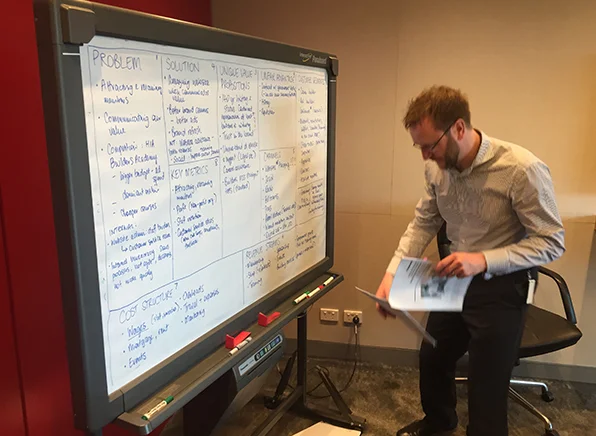
Running a lean canvas session with the client to better understand the business.

Excerpts from transcripts of interviews with users and call centre staff as well as the results of a survey.
Whose site is it anyway?
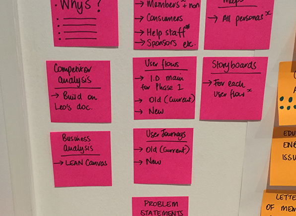
An ongoing challenge for the Master Builders website is the huge variety of users who interact with it’s substantial (and growing list) of services on offer. Persona research was extensive with one-on-one interviews, surveys as well as mining the data that Master Builders could provide through call centre insights, previous surveys and interviewing their dedicated customer service channels. Presenting all users with navigation to get them to where they need to go quickly and without overwhelming them required a lot of listening and patience. Each department was eager to be prioritised and it was fortunate that user research could settle the differences. In the end, open and then closed card sorting provided a way to categorise information which was ultimately by user needs/services. Validation of the results was confirmed observing users navigate low fidelity prototypes to complete simple tasks.

The final round-up of personas which focused design efforts on solving user problems.
What to keep and what to throw out
A site audit that included content analysis and online analytics tools highlighted that content would need to be filtered through a stringent set of new rules before being migrated to the new site. A content bible and language guide was suggested for content contributors going forward.
Affinity mapping the call centre stats provided a starting point to prioritise user issues with the site, and to decide what could be solved digitally in future without any human interaction required.
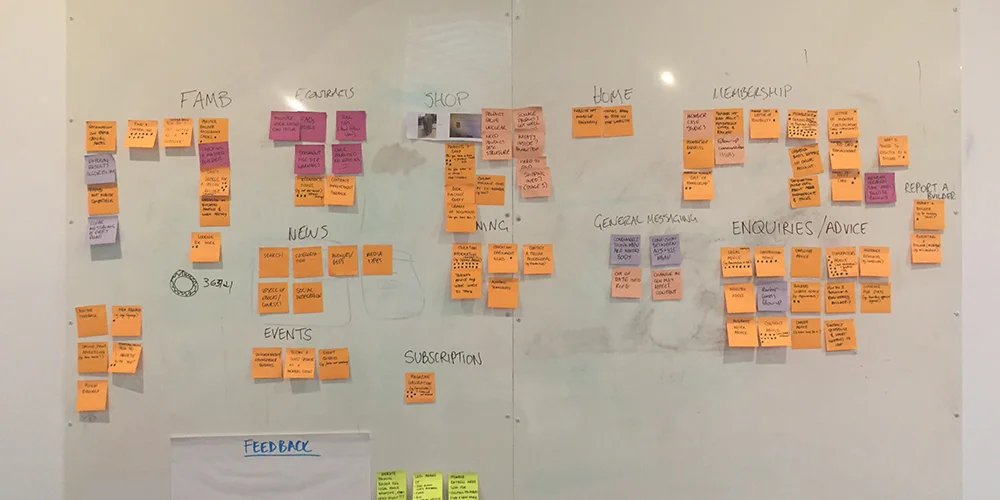
Affinity mapping the results from the call centre statistics.
Business vs User
Master Builders defined its users by their own internal membership types. This created a disconnect with the site’s users as they tended to define themselves either by their line of work or in terms of whichever building project they were on at the time. Being that all the content was categorised according to these internal concepts, it was hard for users to find their way around the site. Utilising user-centric ontology and taxonomy proved to be much more relatable to these users. Gated content because of legal requirements also made it tricky to garner trust from the user so helpful communication was appropriately peppered throughout the new wireframes for transparency and to help manage the expectations of the user.

User journey maps were key to communicating the experiences and frustrations of users.
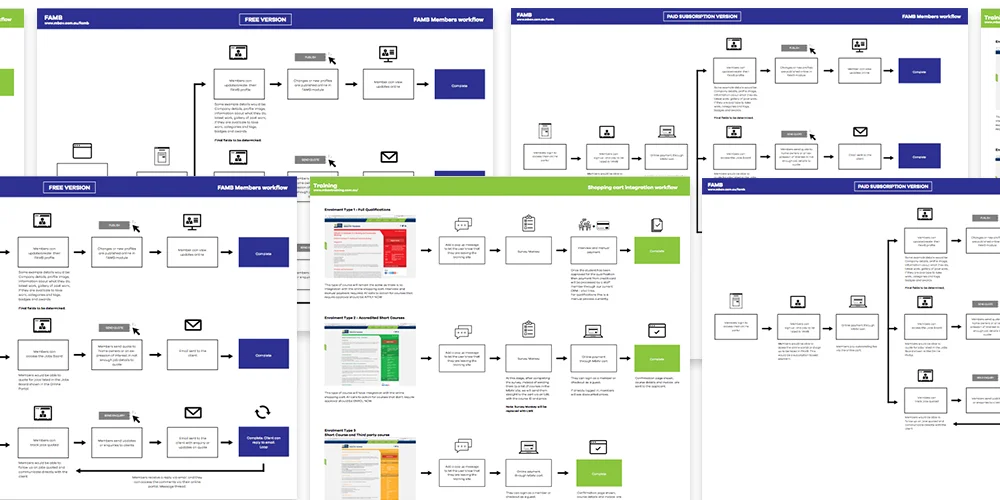
User flows were essential in identifying potential problems in the flow of an activity as well as itemising the elements needed for design.
Journey on
Watching users navigate their way through the current site to do even the simplest of tasks was very enlightening. User journeys were fraught with painpoints most of which were due to the site being very out of date. These enabled us to tighten up processes on the new site but it also shed light on how users sometimes like to navigate the site in surprising ways. Some new ideas had to be disregarded in favour of keeping some pathways similar to the current site and therefore the learning curve gradual. Staff became quite excited about opportunities for ways in which the website could make their jobs (selling, servicing, troubleshooting) easier so observing them navigating the old site as well as new prototypes was key. The user journeys also illuminated the painful truth that key processes like member sign up and product purchase had unnecessary hurdles which were losing the client money and wasting staff time.

Wireframes drilled down into every detail. Interactive prototypes were iterated and tested with users and teammates unfamiliar with the project.

Invision was a great way to track iterations and feedback.
PROTOTYPES for the win
Interactive prototypes in Invision provided an easy to learn activity for the client team and a manageable feedback trail. User testing on the prototypes through observed task solving validated wireframes or sent them back into the design loop for revision.
The team that plays together
The Master Builders team was highly collaborative and enjoyed being educated about UX processes. Daily standups for the internal team highlighted hiccups before they became issues. Full research findings reports, weekly chats with the client team to discuss design decisions and feedback on the 2 weekly design cycle kept communications channels open and the process iterative and flowing.

Running collaborative design studios became a weekly activity for ideation as well as making sure each department had their say.
Conclusion
The new Master Builders site is set to be leaner, more focused and future ready. While a major emphasis of the project was its new design, the revised site structure is much improved with user centred IA, elegant hierarchy, unified messaging and effortless onboarding. The challenge will always be to balance the necessities of the business like legalities and bureaucracy with the shifting needs of its assorted user base. Ongoing user testing will be crucial for future iterations of the site. It was a pleasure working with this client and bringing them along the UX journey with multiple presentations and collaborative ideation sessions.